Thinkmay
✺ Freelance Product Designer · 2026
Cloud PC is hard to explain, so I led with what it does for you, and made the app ask first for the one thing that decides how it feels: your nearest server.
Context. Thinkmay is a Cloud PC service: rent a high-spec remote machine to play heavy games or do graphics work on whatever device you have. The startup brought me in to design the entire experience: landing page, website and mobile app.
Design decisions.
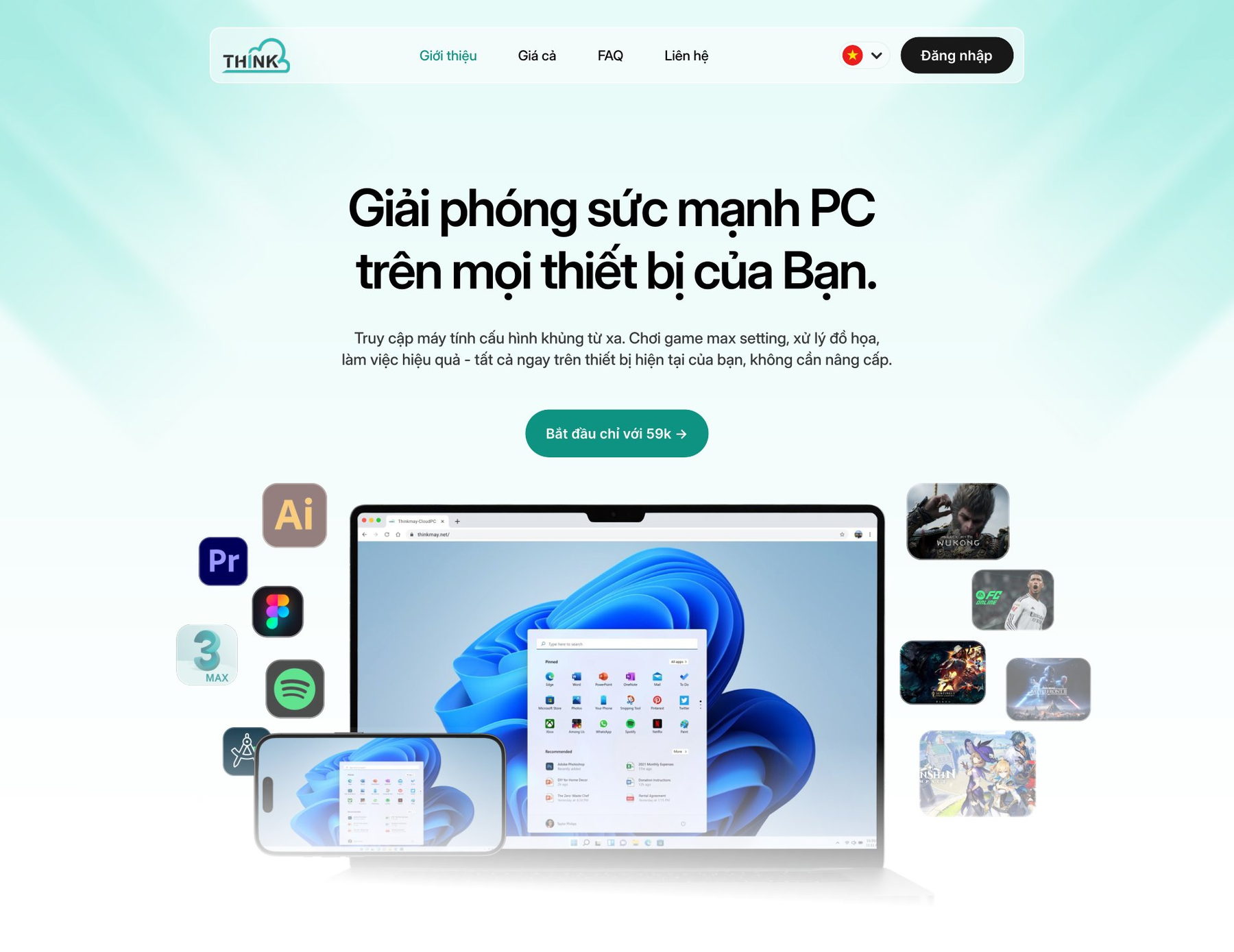
- Lead with the benefit, not the jargon. The hero promises PC power on every device you own instead of explaining streaming, latency and data centres. The jargon goes; the condition behind it stays, and the app asks about it first.
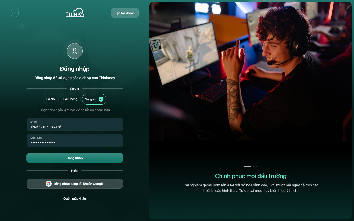
- Ask for the condition that matters first. Distance to the server decides whether a session feels like a local PC, so sign-in asks for the region before the password: the one condition that shapes the experience is the first thing people choose.
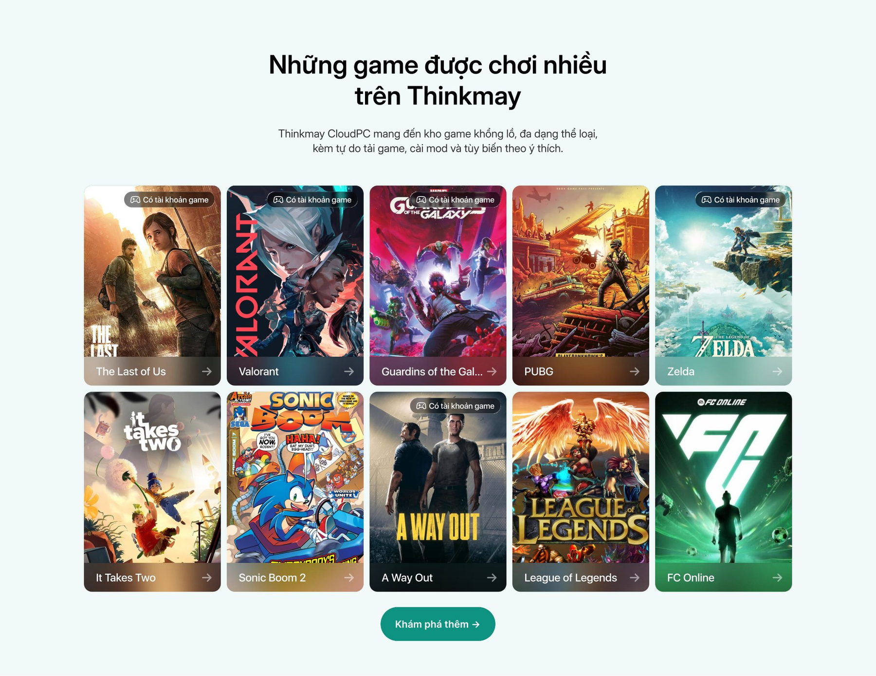
- The game library is the proof. A grid of original cover art with a "game account included" badge answers both questions at once: what can I play, and do I have to buy it.
✺ One decision, start to finish
Show the limits before the payment.
- Problem
A Cloud PC promises a monster machine on any device, but what people actually get depends on two things they cannot see: the tier they rent and the distance to the server.
- What I saw
The nearest region decides whether a session feels local, and each tier runs the same game at a different frame rate.
- Options
Keep those conditions in an FAQ, or put them inside the flow, at the moment they matter.
- Choice and cost
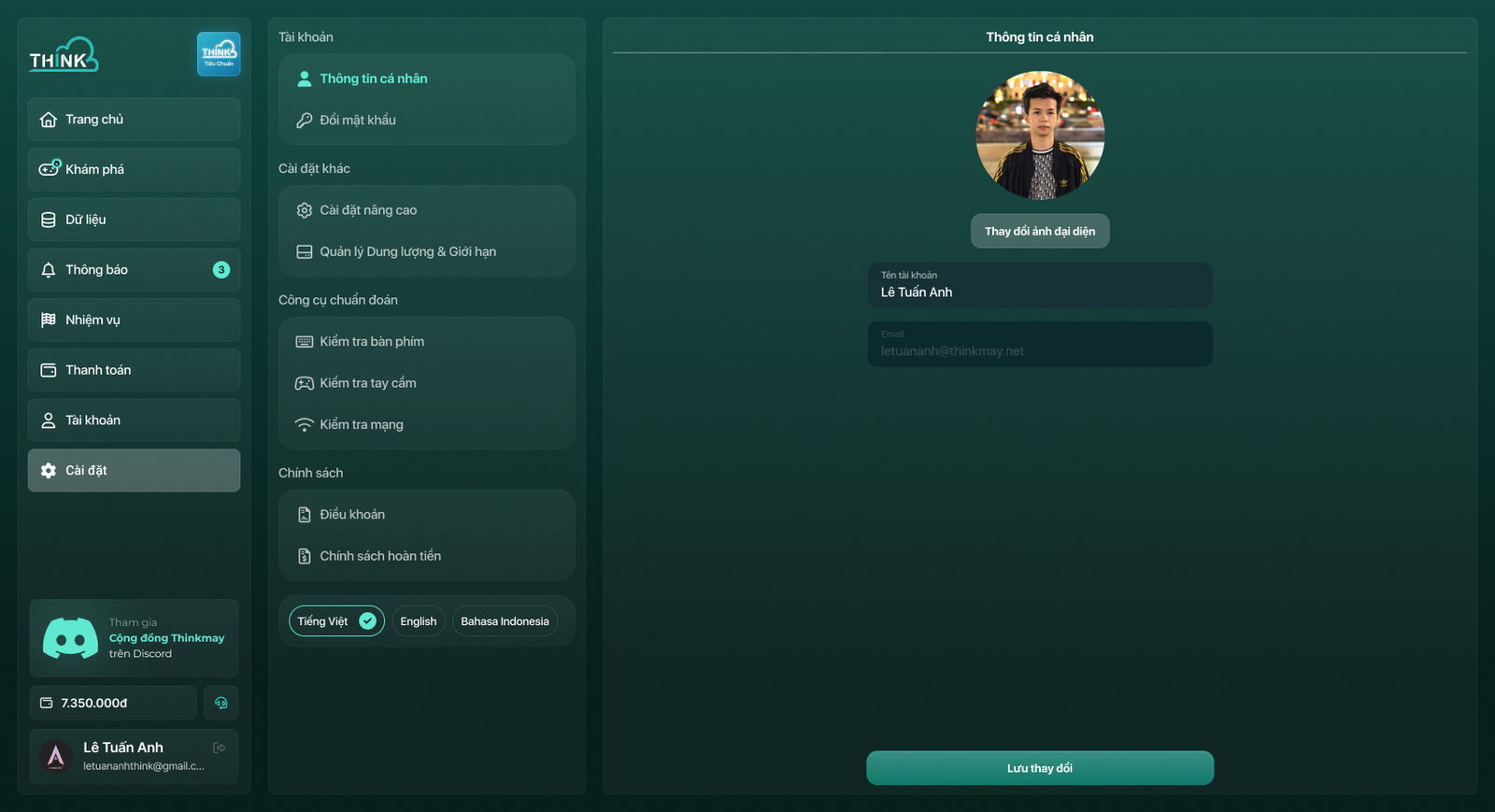
Inside the flow. Sign-in asks for the server before the password, every game page shows the frame rate on each tier with your current and the recommended one marked, and settings has a network check. The cost is extra information on screens that could have just said “Play”.
- What happened
The product sets expectations before the payment, not after it: people see their server and their frame rate before they commit, which is where trust in a rental product is won.
✺ The product itself
The landing page sells it once. The app has to keep the promise.
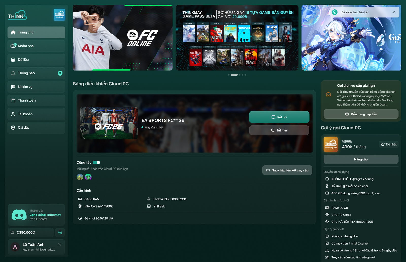
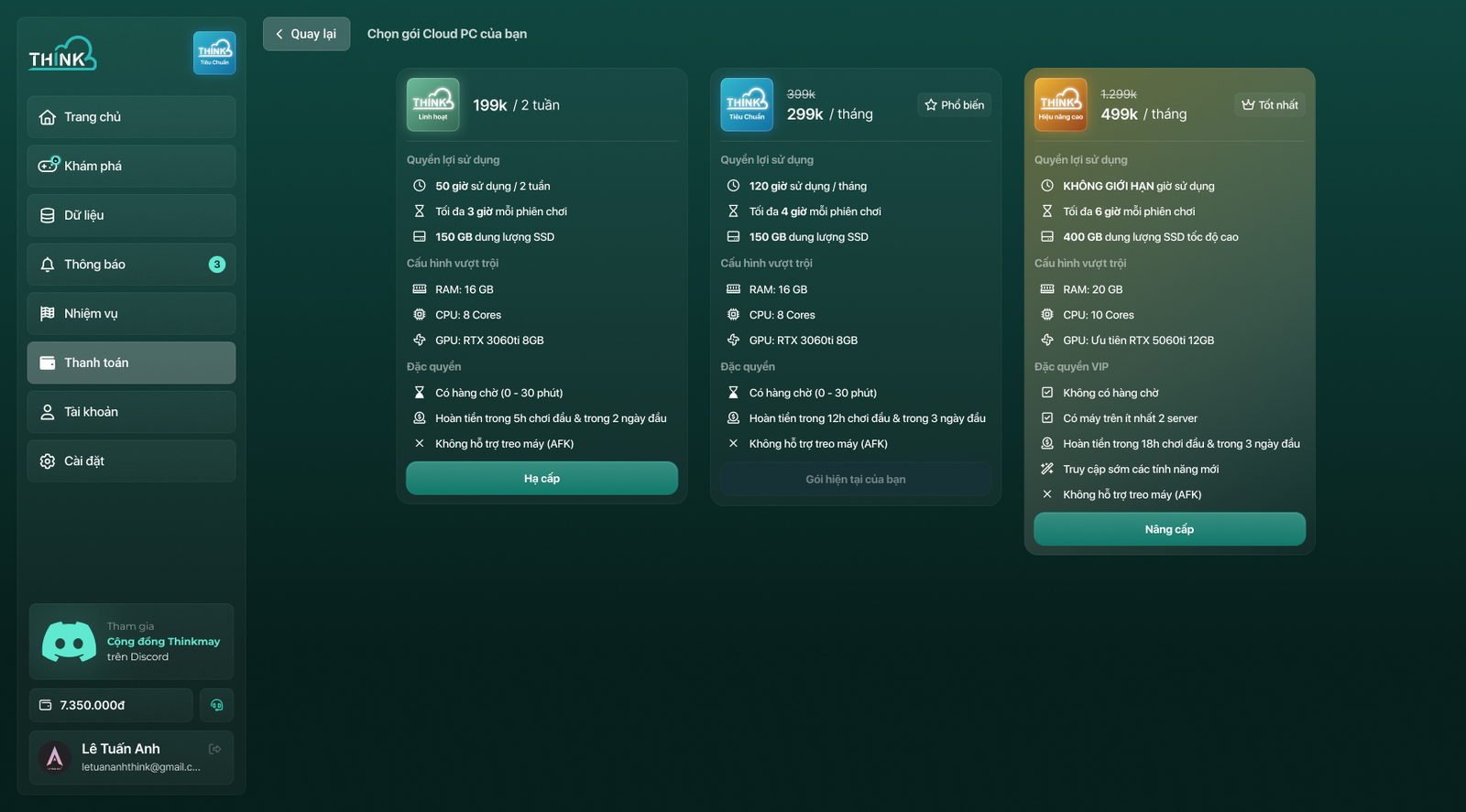
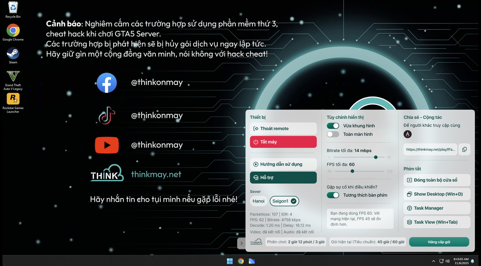
Behind the landing page sits the machine people actually rent. I designed the whole flow: sign in, the Cloud PC dashboard, a browse page shelved by mood, the control panel floating over the running desktop, plans and settings. One dark green system, so nothing feels like a different company past the checkout.
 Click for the full page
✺ On the phone
The same machine, in your pocket.
The mobile app carries the same dark green system: a first screen that asks you to sign in or start, the Cloud PC dashboard with your hours and specs, game pages and settings.
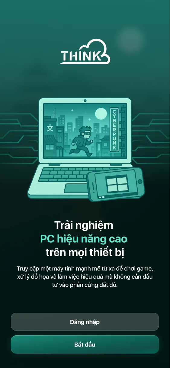
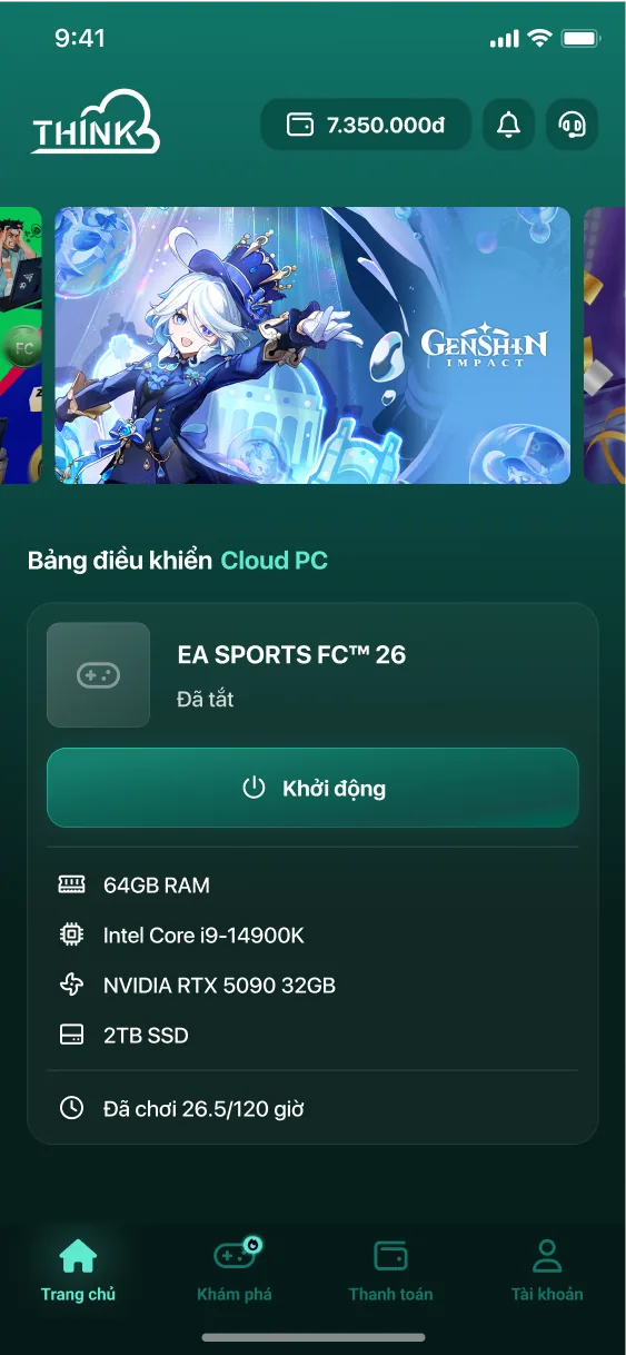
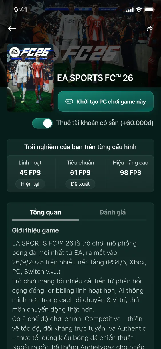
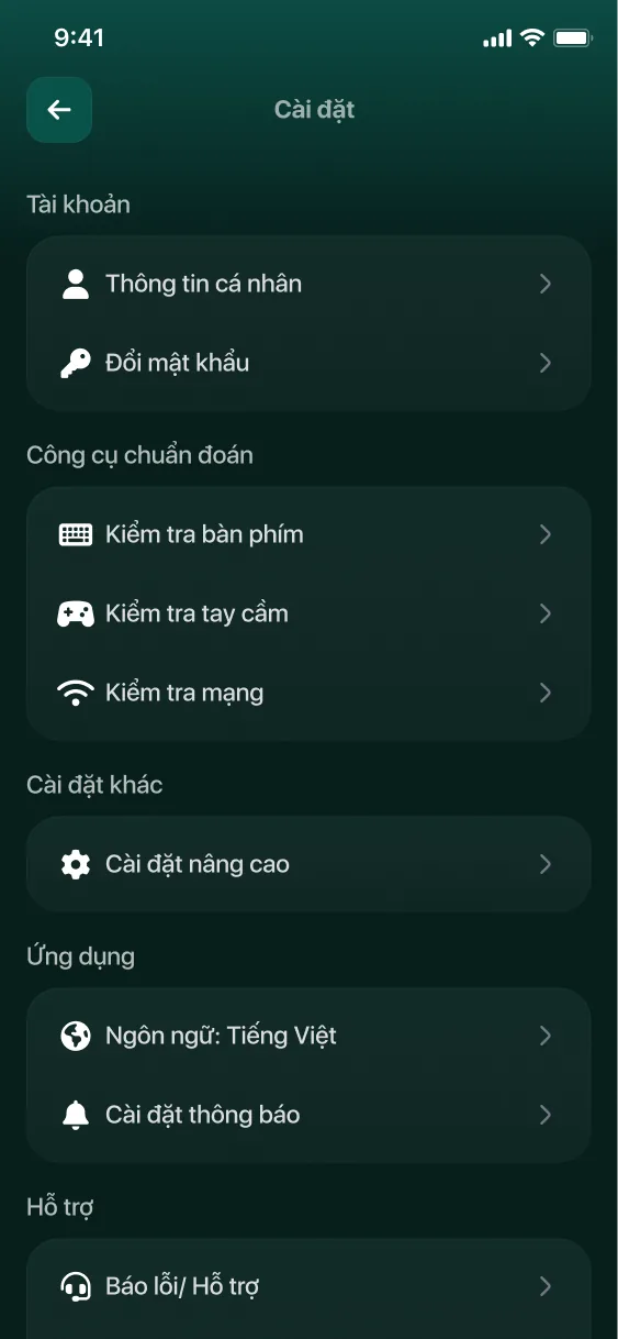
Left → right: first screen · Cloud PC dashboard with hours played and specs · game page with the frame rate on each tier · settings with keyboard, controller and network checks